
Bitter Sisters Brewing Co.
Blueprint Process + Can Design
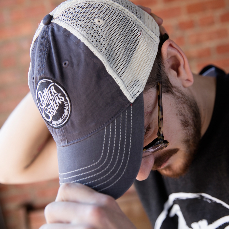


The Story
Three type-A sisters and their laid-back baby brother walk into a bar. Wait, it’s not a bar, it’s a brewery. And they and their spouses own it! Bitter Sisters Brewing Company is a true labor of sibling love, so their brand needed iconography and copywriting that fully reflected their unique space in the dynamic world of craft breweries.
Bitter Sisters’ handcrafted aesthetic fit perfectly with the Robot House BluePrint Process, so we worked closely with them to painstakingly craft a logo and brand platform that tells their wholly original story. We limited the color palette to black and white so that the logo can really pack a punch when it sits atop the perfect amber and golden hues of their signature beers.
Beer Names
A major thing that sets Robot House apart from our peers is our experience writing sharp, attention-getting, award-winning copy. So collaborating with Bitter Sisters to name their line of signature brews was a delicious task (on many levels). This is a fun family with an irreverent sense of humor, so we sought to capture that spirit with beer-friendly wordplay that would also lend itself well to offbeat iconography.
We wanted the names to be as bold and immediate as the beers they describe, so we quickly hit on the idea of using compound words with a one-two punch. We also wanted to embrace the tough femininity behind the brand. We launched the four core brews: BUSYBODY, CATFIGHT, HISSYFIT, and KNOCKOUT.
“Robot House gets who we are, and that is reflected in the creative designs they have provided. We continuously receive praise for our awesome brand, which provide a great first impression to our family of kick ass beers!”