
Method Fine Cannabis
Blueprint Process + Collateral


The Story
Familiar with our work building the Stargazer Edibles brand, Ryan Cannabis Farm engaged us to collaborate with their team to create a new name and elevated brand identity for their Stillwater, OK based grow, which had developed a reputation for quality and professionalism (in short supply in the early days of Oklahoma’s cannabis community).
We discovered an organization with a truly impressive, state-of-the-art facility, utilizing a methodical approach and innovative agricultural techniques to achieve superior quality, with an emphasis on creativity to ensure unique product selections to stand out amongst their competition.
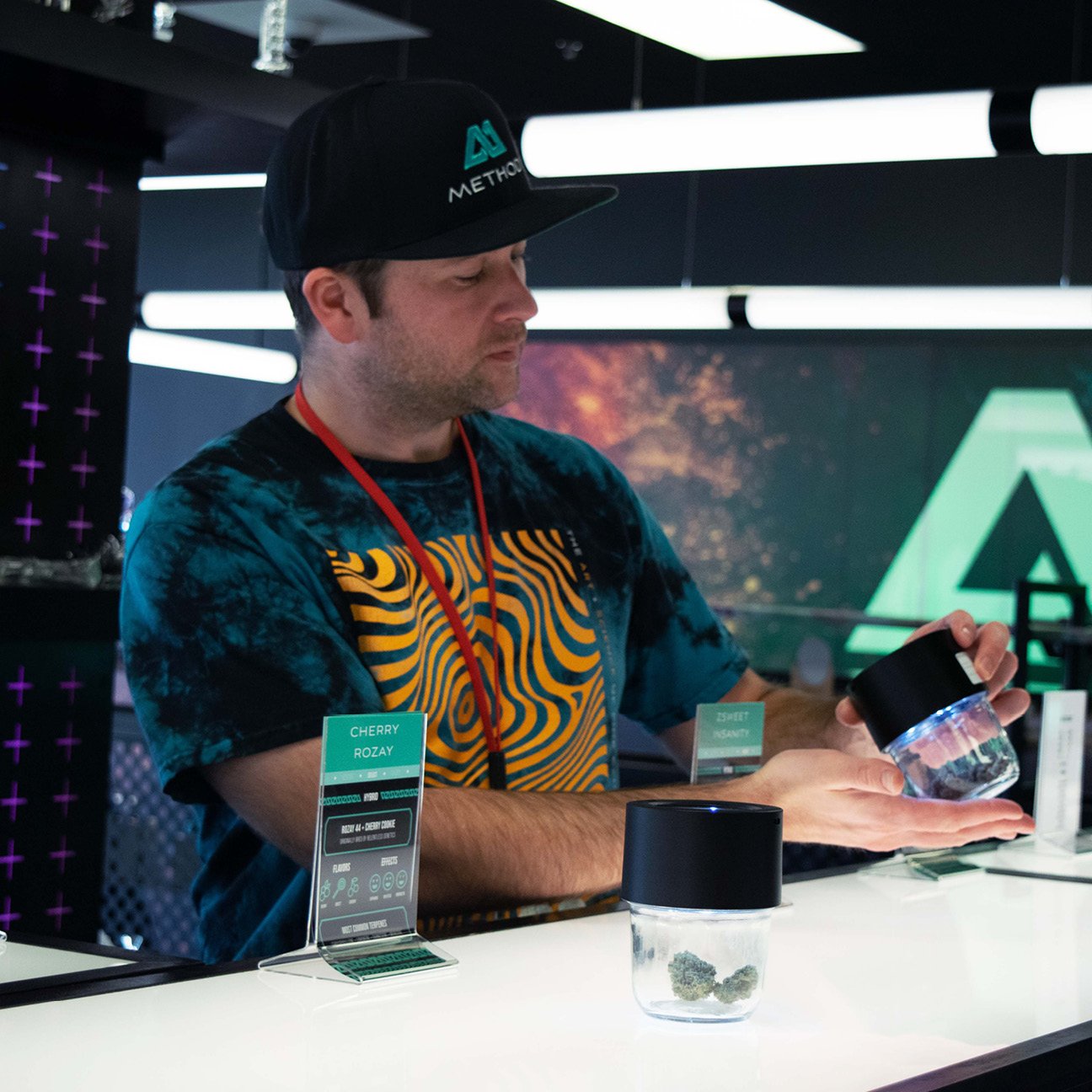
Those were the elements that inspired the name Method and their brand theme: The Art + Science of Fine Cannabis. We built not only their brand identity and storytelling platform, but also their packaging and the design of their first dispensary, located in Broken Arrow, OK.
The Method "Infinity M" logo mark stands for the “M” in “Method,” but it also represents the Method approach to cannabis growth and cultivation. The “M” also subtly connects to the importance of “Mother” plants in the cultivation process. By utilizing mother plants to create clones, Method can infinitely extend the life of a high quality resource. An “Infinite Mother,” if you will.
The logo mark also reinforces positive movement and growth through upward angles, and its dual peaks signify the brand's dual ethos of art + science. It is built for easy adaptation with color and texture, and, at its core, represents Method’s unique approach and commitment to best-in-class cannabis product.